First Northern Bank
View the work- Role
- Self-directed interview sample
- Problem
- Explore how the bank’s existing green could support different financial and community stories.
- Proposed
- A color system and sample applications for reports, people, and business content.
Unprompted and unpaid, I made this for my First Northern Bank interview to show how I’d approach their color before being asked.
The bank already owns a green, and a rebrand shouldn’t spend that equity. My question was what that green needs around it so a marketing team can post daily without every post looking the same.
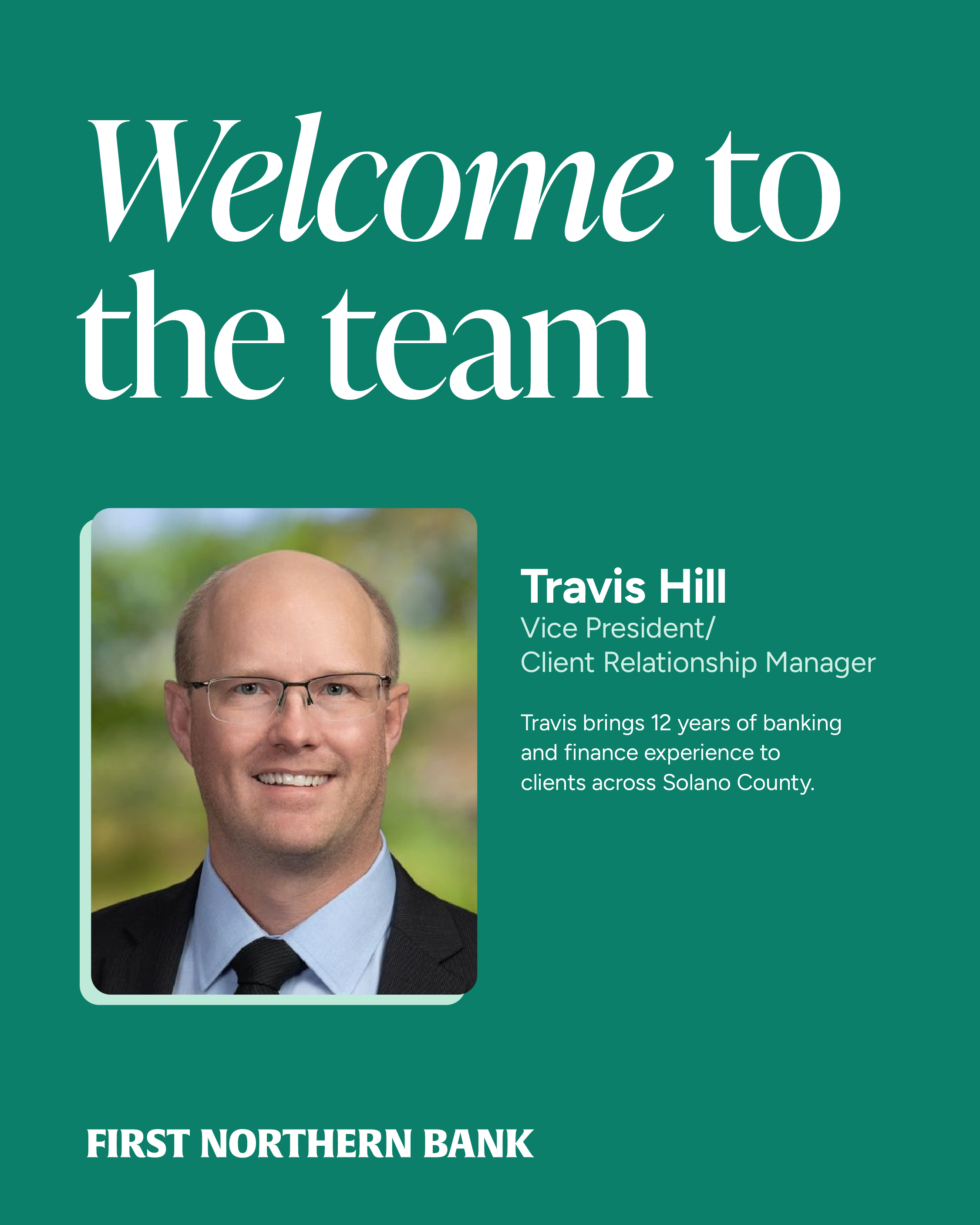
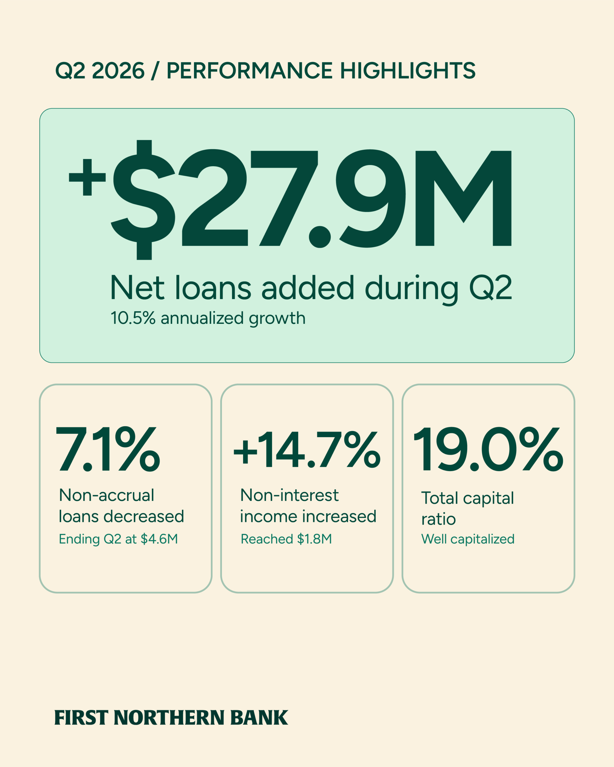
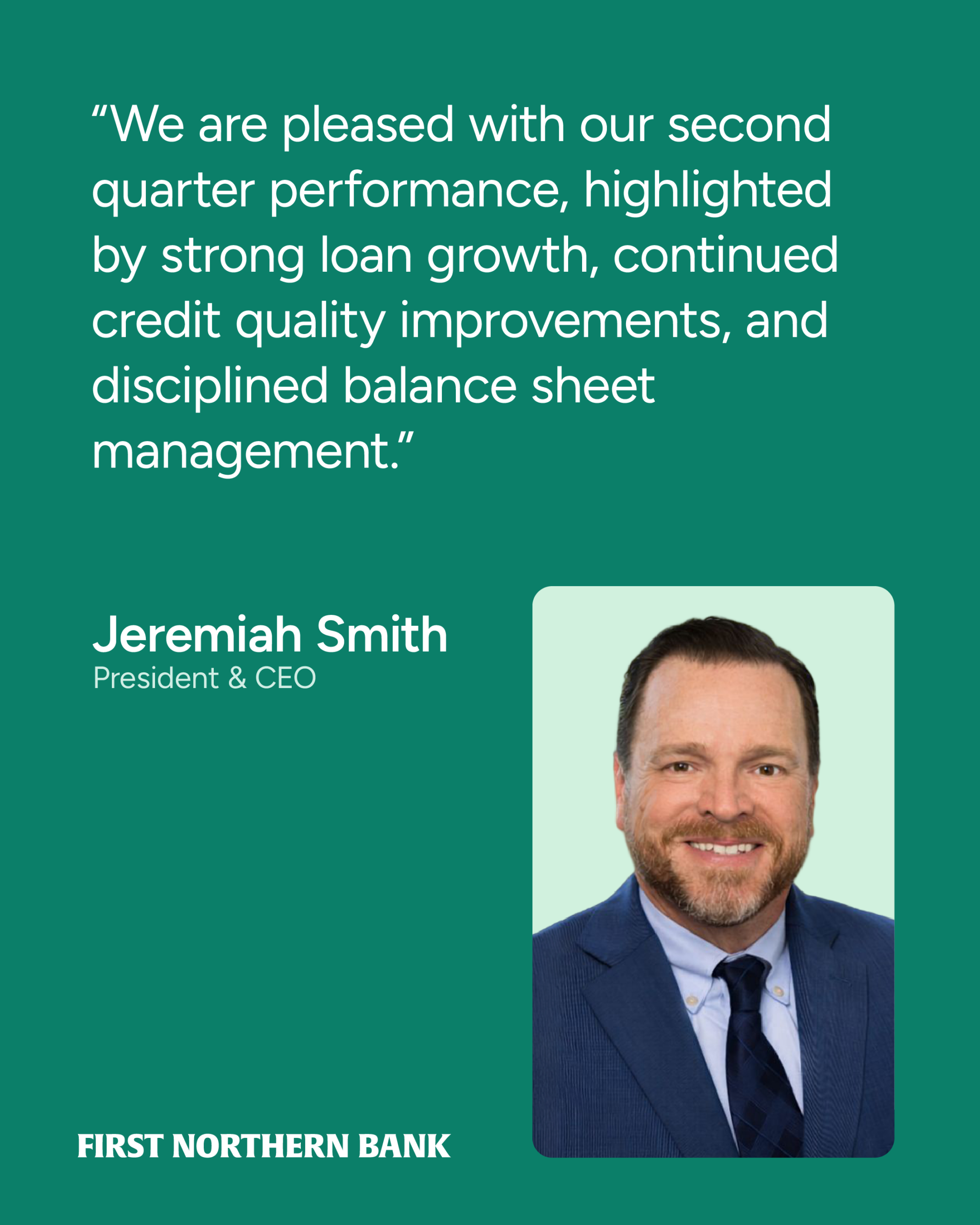
The answer is five colors with assigned jobs: forest for authority and financial reporting, jade for people and community news, mint and sage as support, cream for editorial and commercial stories.
The applications are the test. Same palette, four emphases, so a quarterly report and a new-hire announcement read as the same bank without reading as the same post.
This is a direction, not a finished system. I’d refine it with the bank’s marketing team against real accessibility standards and a real production calendar.
Selected work
Speculative · interview sample
Local Business Campaign
Take-home campaign concept · Print and LinkedInA short campaign positioning First Northern Bank as a locally informed banking partner for Greater Sacramento businesses.
Project notes
Proposed palette
Directions to explore
Lead with local photography and one clear message.
Make existing programs easier to understand.
Build on the print and LinkedIn campaign above.
Refine accessibility and templates with the bank’s team.